Permanent Style posted an interesting article by Philipp Fröhlich recently about color theory in clothing. This expands upon a common conversation which generally revolves around a simplistic view of choosing colors that are flattering on one own’s complexion. One example of the simple view is that people with low-contrast complexion (e.g. fair skin and light hair) are better off avoiding suits / jackets / tops that are especially strong or dark, as dark colors tend to wash them out. The reverse is similar – folks with high-contrast complexion (such as light skin and darker hair, or very dark skin) tend to look best when they choose stronger and darker colors, avoiding lighter more neutral colors that do little to accentuate their features.
I think that is broadly true, but it does lack a key element of putting clothes together, which is the contrast of the colors of the clothing items themselves, notably when adding the shirt and even accessories into the mix. This is one of Philipp’s several points in the article. Alan Flusser wrote a little bit about this in Dressing the Man, and while that commentary is still widely discussed and referenced, the nuance has gotten a bit lost in the mix, and the conversation has devolved into often only considering the primary pieces (like choosing a suit or sport jacket based on the fabric color).
Philipp talks about these ideas through a more intellectual color theory lens, which I found especially interesting as I’ve been going through Joseph Albers’ Interactions of Color recently – a book Philipp references in his article. One element of Albers’ teachings is how the relative strength of a color is impacted by the colors that surround it. This is relevant to the impact a garment’s color has on your overall look based on the surrounding clothing items you pair it with. I wanted to share a few photos that I think illustrate this particular point, and help you see how it makes a difference when putting clothes together.
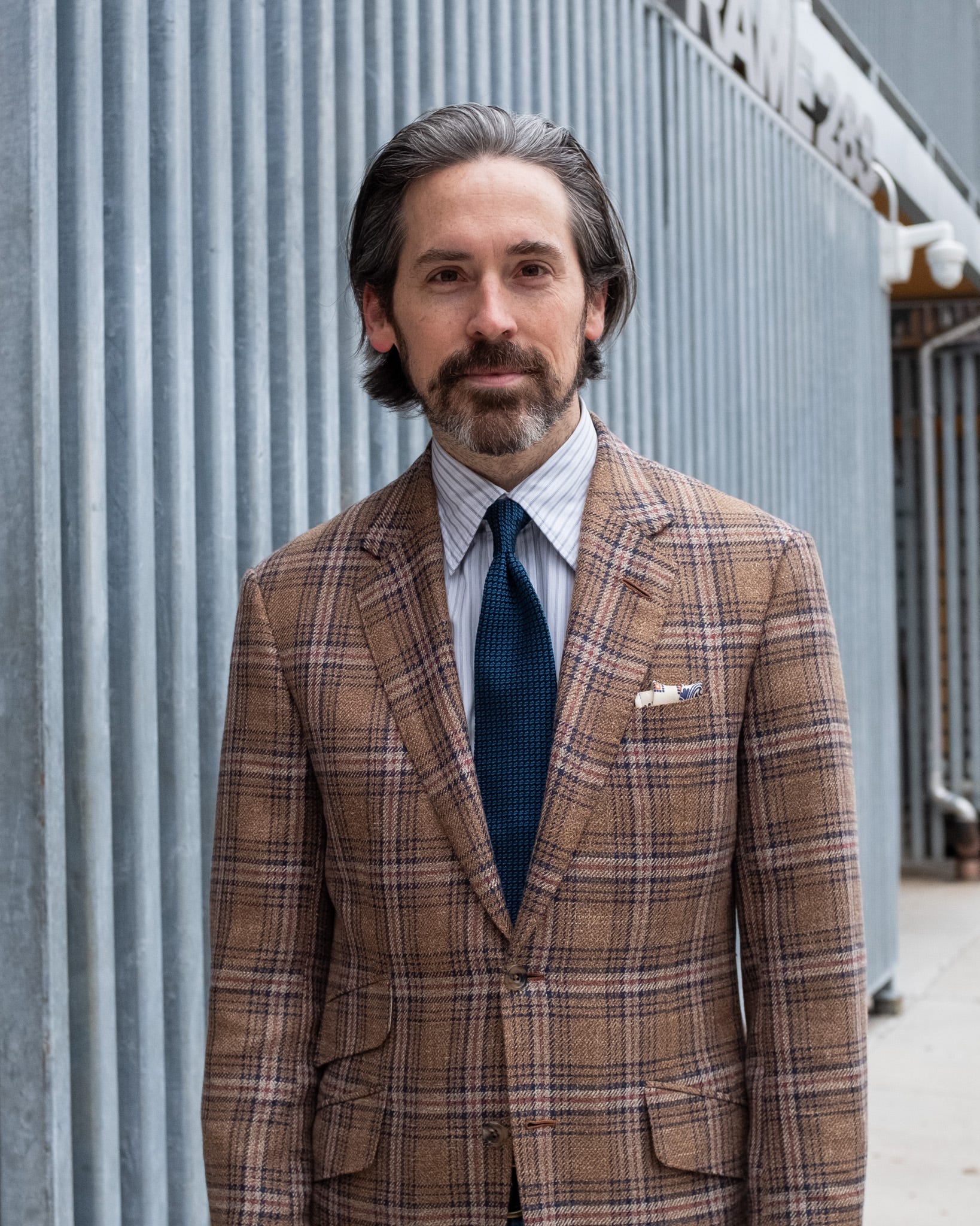
I have what you might call medium to high contrast complexion. In the below images I’m wearing a sport jacket that I like quite a bit. However, the jacket fabric isn’t a color scheme that is particularly flattering on me. I have rather fair skin with warm tones and particularly dark hair, and the strong copper base color of this jacket does nothing positive for my complexion. I know that, but I still like the jacket. So, the idea is to wear it in outfits that lessen that negative effect, and bring in as much contrast as possible. These photos illustrate a not-so-good way to wear it, and then a couple of better ways.
In this image with a tattersall shirt, the cream base is too close to my own complexion and the colors of the jacket, and the open neck just shows more wintery-pale skin. The issue is with this tonally-styled color palette there is almost no contrast between my complexion, the shirt, and the jacket. It’s not particularly flattering, and can even make me look a bit sickly in certain light.

In the below image, I’m wearing a white multi-striped shirt and a strong blue grenadine tie. These pieces bring together the colors of the glen plaid in the jacket, while also providing a fair amount of contrast among the clothing items themselves. This is helpful to frame the face better, adding a strong dark color with the tie and breaking up the copper jacket color from overwhelming my complexion. Philip references this in the section “black and white can separate colours.”
You can’t often just add a tie for extra contrast when wearing casual clothes, so here’s an outfit with a dark blue washed denim shirt, which offers a similar effect by separating the lighter colors of my skin and the jacket. This is how I wear this jacket most of the time. You could even say the tan cap helps further here by connecting with the jacket overplaid colors, and lessening the contrast of my dark hair, but we might be getting into overthinking it territory.

Last is an image with a navy coat on top. This changes the overall look, and turns the copper jacket into more of an accent color. It becomes more flattering as it’s a small sliver of color that picks up on my complexion, rather than overwhelming it like the full jacket does. (Similar to the way a well-chosen pocket square complements a tie, rather than matching it.) Obviously I can’t walk around in a coat all day, so this is simply illustrative. Hopefully you get the concept, as I could choose this jacket color for something like a copper sleeveless cardigan, and wear it under a dark navy blazer to achieve similar effect.

So, that’s my quick and dirty layman’s explanation of one of the points of the article – utilizing color contrast among the the different articles of clothing you wear.
One last thing to note – no matter how you put certain pieces together, the reality is that some colors are simply not as flattering as other colors on individuals. I’ll always look better when I heighten the contrast in my clothes, especially with blues, dark greys, and dark browns which are all helpful for my complexion. Simply from the perspective of color and contrast, outfits like the ones in the pictures below are more flattering on me.
Bruce Boyer once commented that the most stylish people he knows tend to wear whatever they want, regardless of what they preach about choosing colors that are flattering. These are simply guidelines that are helpful to know, but sometimes you just want to wear a professor-plaid jacket.
-JS
(Below – examples of objectively more flattering, higher contrast outfits).